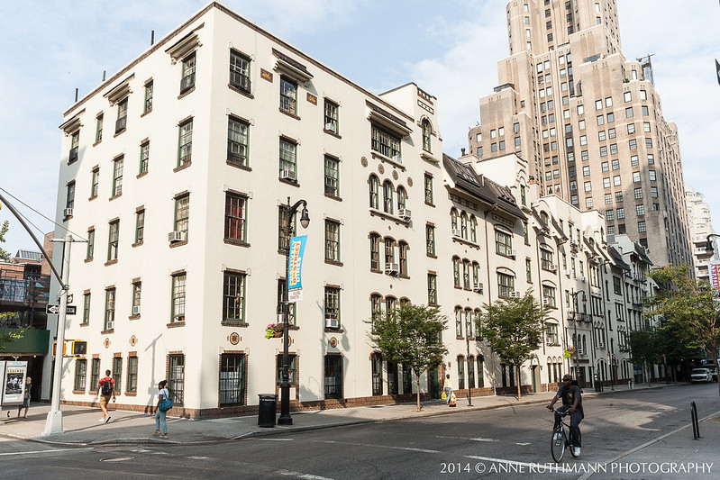
It's not often I feel compelled to do a photo study on a building I haven't been hired to photograph, but after walking by the Deutsches Haus several times, it compelled me to return with my camera in hand, specifically for the direct morning light on its East facades. NYU has recently invested in deep cleaning many of the building exteriors around Washington Square and this building is one which can easily attract the black grit of the city into its many different textures, so I felt especially lucky to capture it in such pristine condition.
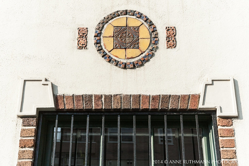
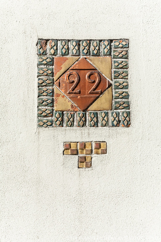
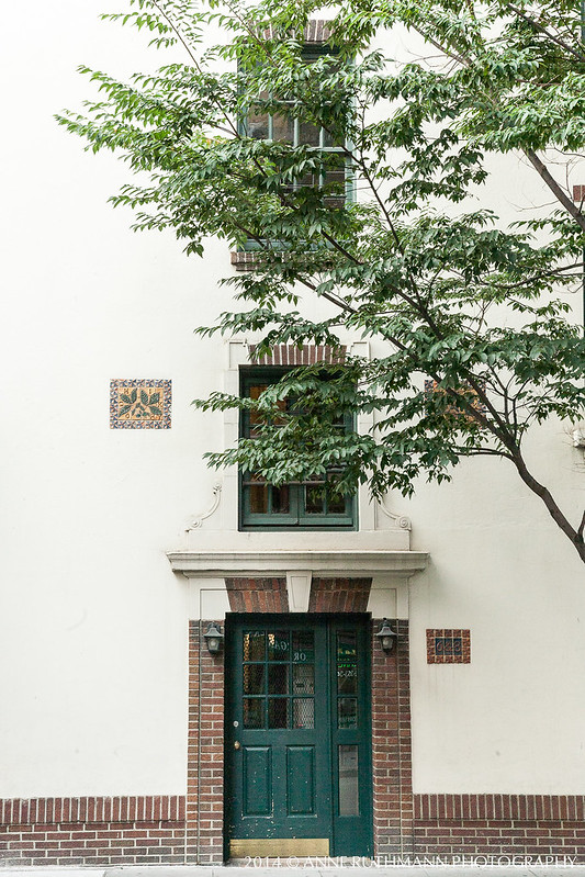
It's such a unique design among the other buildings in the neighborhood, which also means that it gets plenty of attention on its own, but I wanted to document some of the specific details that make it a truly hand-crafted work of love. In order to highlight the dimension and detail on the arts & crafts style tile work, I knew I needed direct lighting at such an angle that the depth of details could be highlighted without too many shadows or reflective obstructions. It took about 40 minutes after my arrival for the sun to move into a position that allowed the tile color and dimension to really stand out beautifully against the stucco walls.
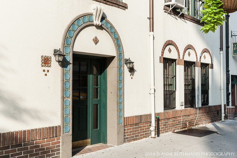
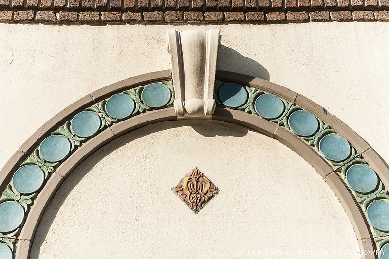
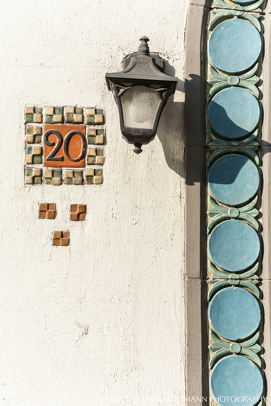
I especially loved this dream-catcher style motif surrounding this door as it makes me wonder if the resident or former tenant had a special connection to Native American culture.
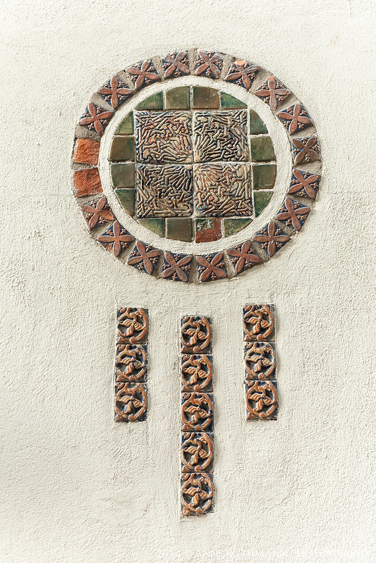
As you can see in tile detail, due to the deep relief and age of the glazes, some of the tiles are coming apart and would be very difficult to replicate with the same glazes originally used. I'm just happy that I'm able to document it as it is right now, before further damage can occur.
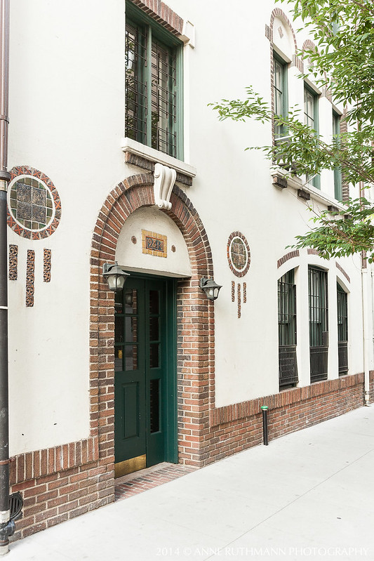
I love that each entrance maintains a separate design that still flows with the entire building design.
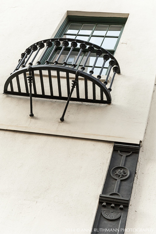
I found it especially interesting how the ironwork contrasted to the other elements of the building.
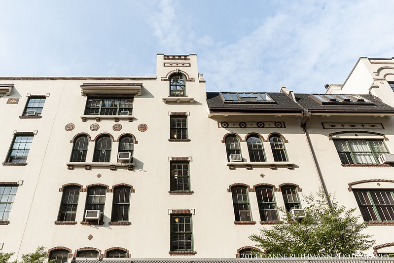
The architect and designer created just enough unique elements between different sections of the building so as to delineate each vertical section of windows as a unique set from the adjacent columns of windows, emphasizing a row-house arrangement on the interior while retaining a sense of grand cohesion on the exterior. I especially like how the rooftops are different shapes and create an outline for each column of windows intending to represent which windows belong to the same or different units.
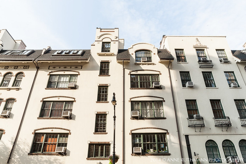
Even here, where there is structural symmetry, the exterior design clearly defines that these are to be regarded as uniquely separate spaces.
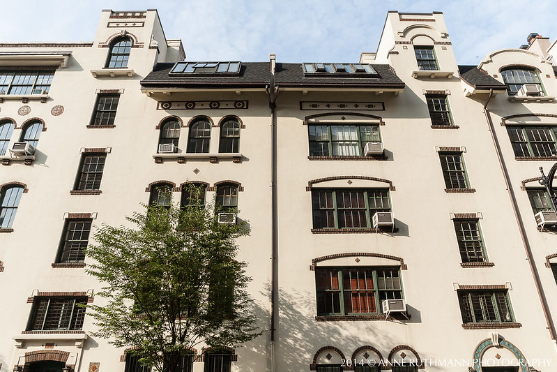
This particular skylight section almost suggests that there should be a bell tower here, as if it were a Spanish mission.
At the far end, it feels almost Italian with the crest relief and faux balconies under windows.
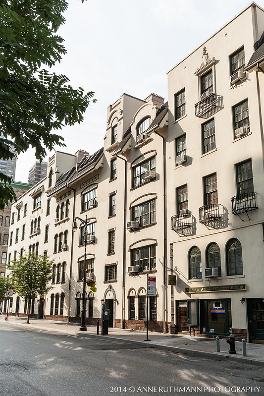
If you're interested in learning more about this building's past and its current occupants, I found a great lecture on the history as well as a link to public events sponsored by the NYU Deutsches Haus:
Video Lecture on the History of Deutsches Haus:
https://www.youtube.com/watch?v=NS5MTahTknk&feature=youtu.be
Public Events at the Deutsches Haus:
http://deutscheshaus.as.nyu.edu/page/events
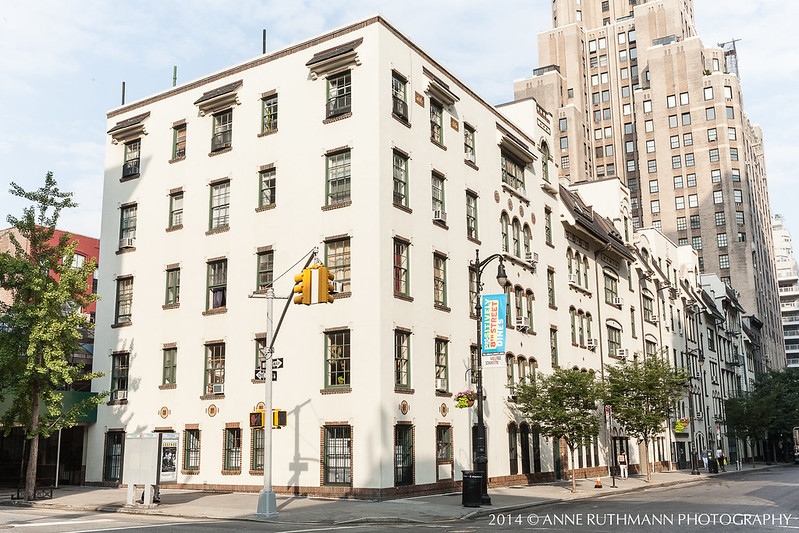
Historical Note: these images were taken on August 1, 2014 and are not altered beyond exposure and white balance adjustment in order to preserve historic archival integrity. If you would like to use or license copies of these images, please contact Anne Ruthmann Photography directly for more information.

No comments:
Post a Comment